3 smaller initiatives worth highlighting.
The common thread between these projects is that they required taking stock of what was being done—whether that be for customers or internally within our company—and figuring out a way to make a team process or piece of design better, for everyone.
Product Imagery Guidelines
1 of 3 Betterment Self-initiated Work 2021Helping Product Designers create their own product illustrations.
Opportunity
Product designers are constantly producing work that need image assets. These assets are produced by the Brand Creative Team and securing their time is difficult as they are a much smaller team with marketing priorities of their own. I saw an opportunity to remedy this problem.
Solution
With guidance from the Brand Creative Team, I created Product Imagery Guidelines in Figma. The goals of the Guidelines:
Provide product designers with guidelines on how to create their own images, without relying on the Brand Creative team. The guidelines removed a roadblock, the images are easy to create—they do not require illustration skills.
The document streamlined the number of styles being executed. It got all designers on the same page in terms of how product imagery should look—we now had guidelines in place to maintain visual consistency from project to project.
Promote the use of product imagery across the Product Design and Brand Creative teams. Product images are clarifying for users—they let folks know what to anticipate in terms of interacting with our product and UI.
Product Imagery Example board
Product Imagery Guidelines
Navigation Redesign
2 of 3 Betterment Web Experience Team 2021Redesigning our website navigation to reflect Betterment’s product evolution and growing user needs.
Opportunity
In late 2020 we started our Information Architecture (IA) strategy work—we took stock of our vast body of web content to understand how we should re-organize and re-position ourselves to prospects and customers, to accommodate an ever evolving and expanding suite of products.
Solution
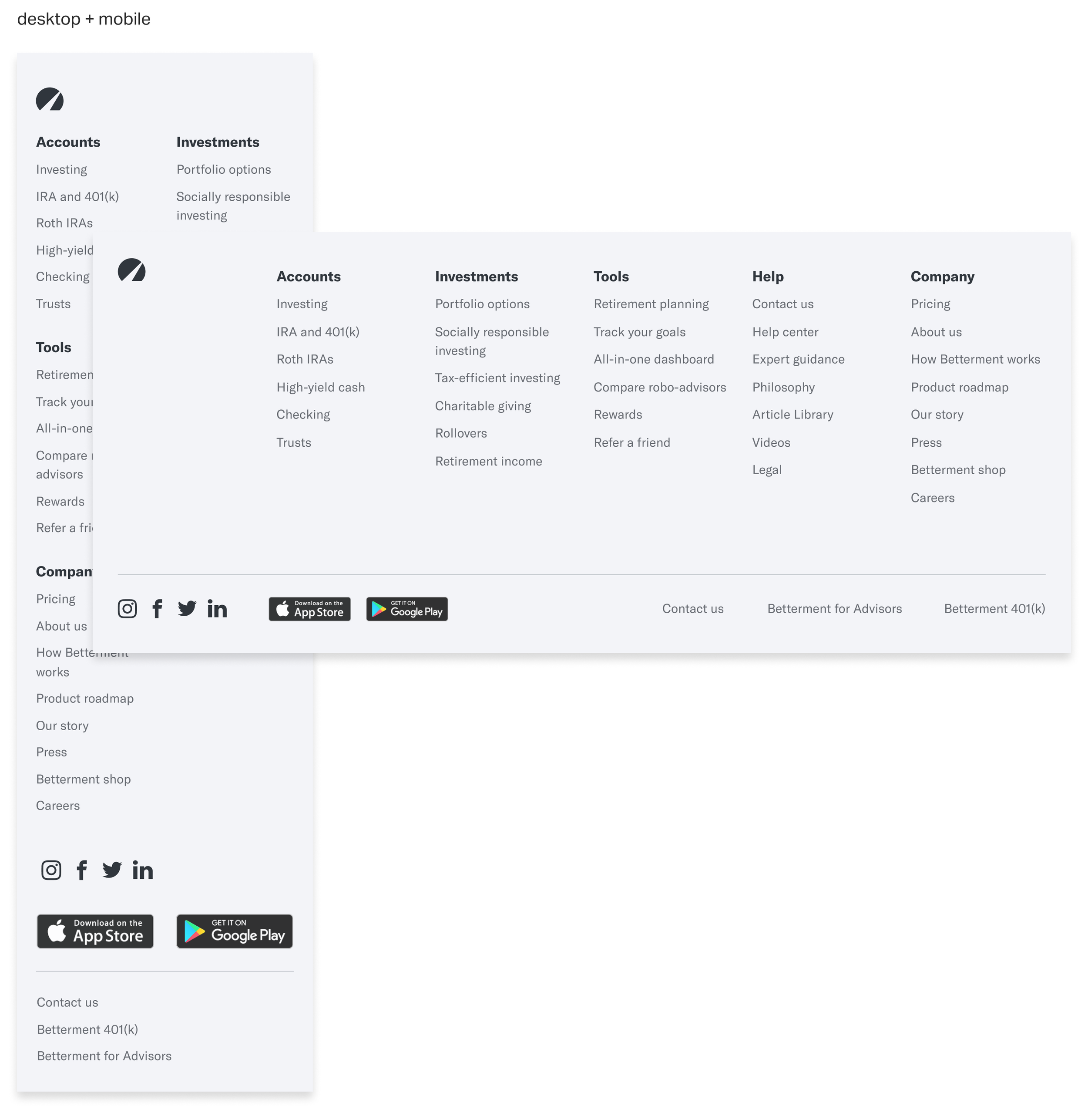
Prior to our IA work, our website top-navigation had not been been designed with drop-down functionality (nor did our footer show a true breadth of everything else we offered). We hypothesized that this greatly limited how much a prospect could browse our product offerings, services, resources, etc. And so naturally, we redesigned our website top nav and bottom footer to reflect our new IA strategy work. This was also the perfect time to update our nav according to accessibility standards.
Navigation
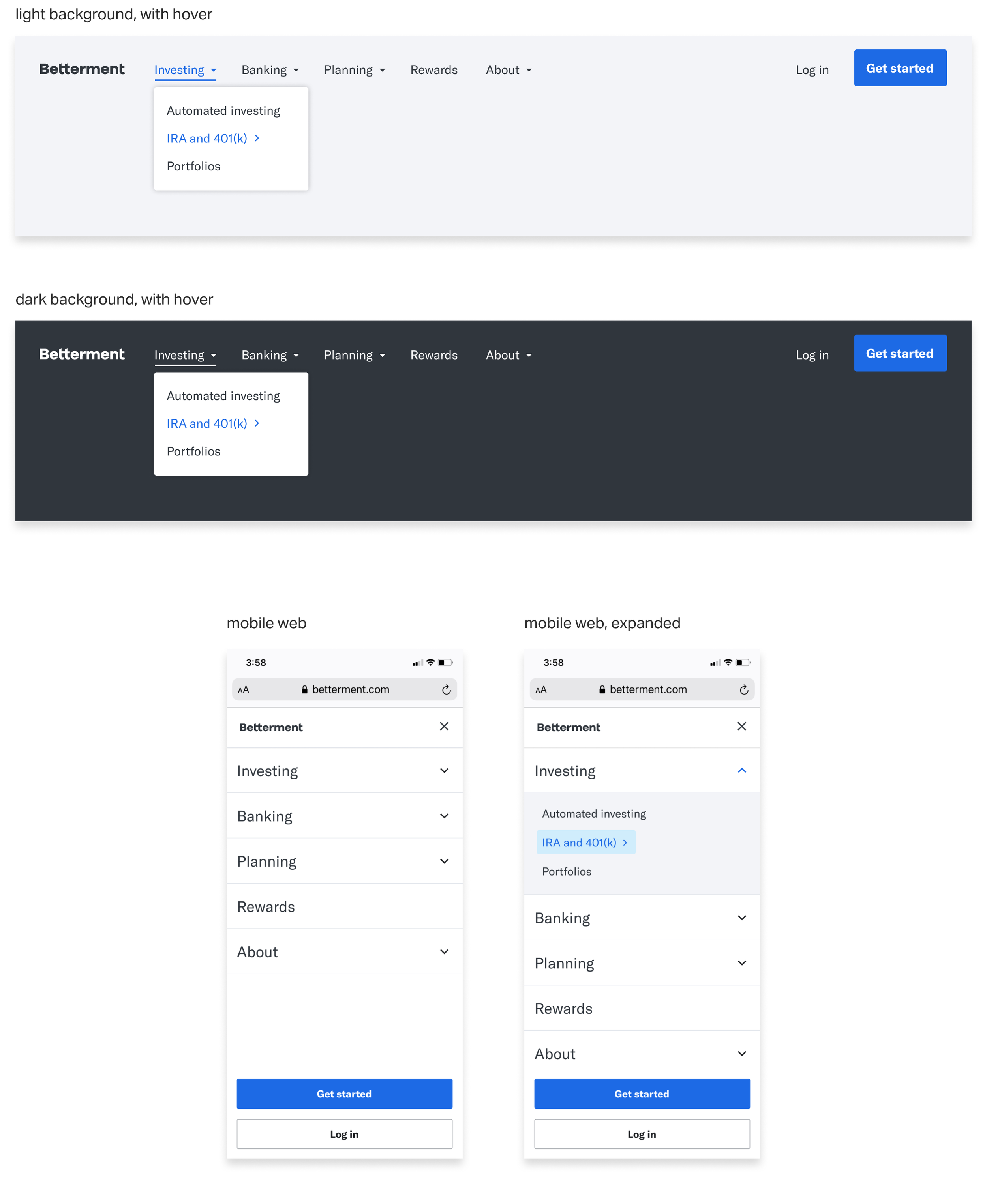
Footer
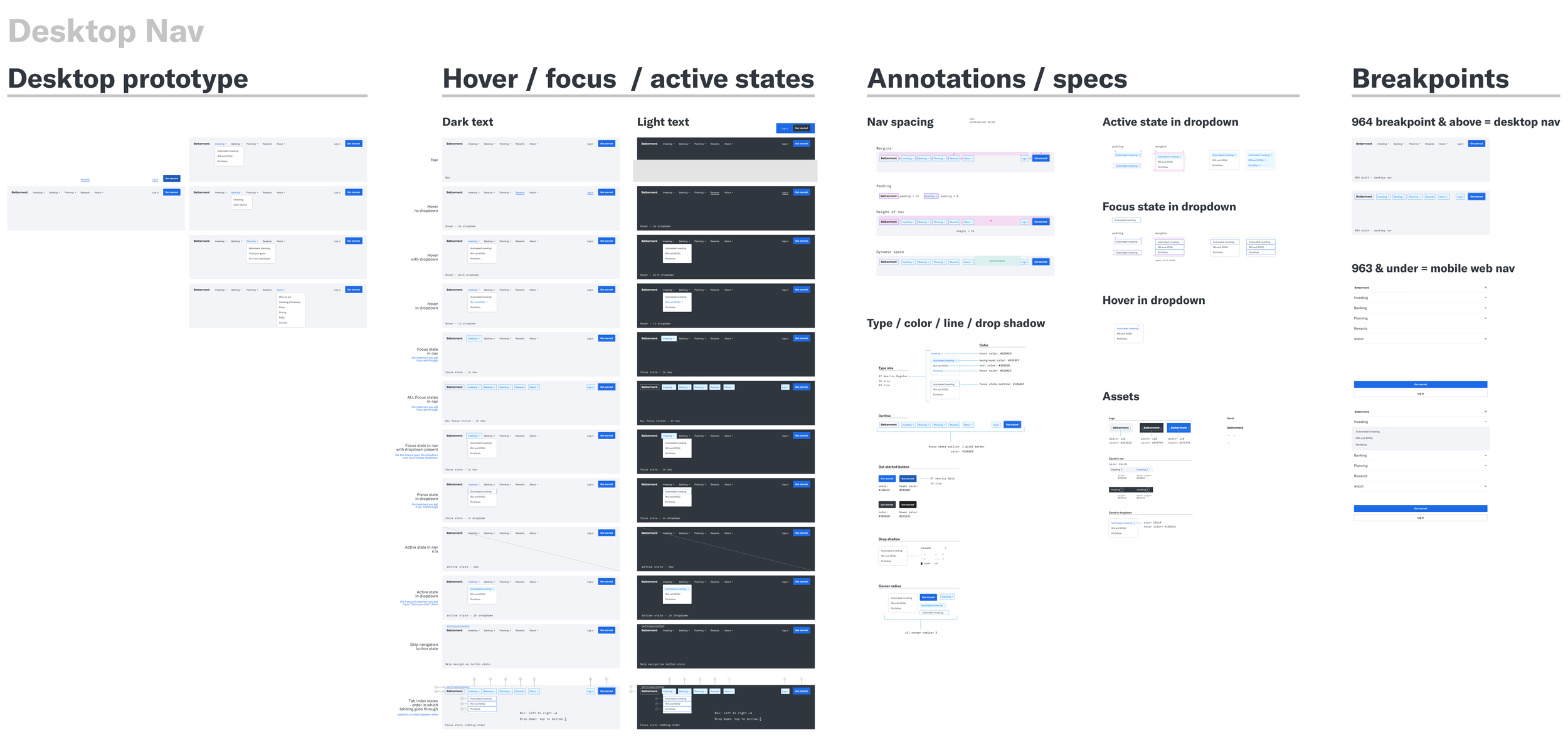
Snippet of Engineering handoff doc
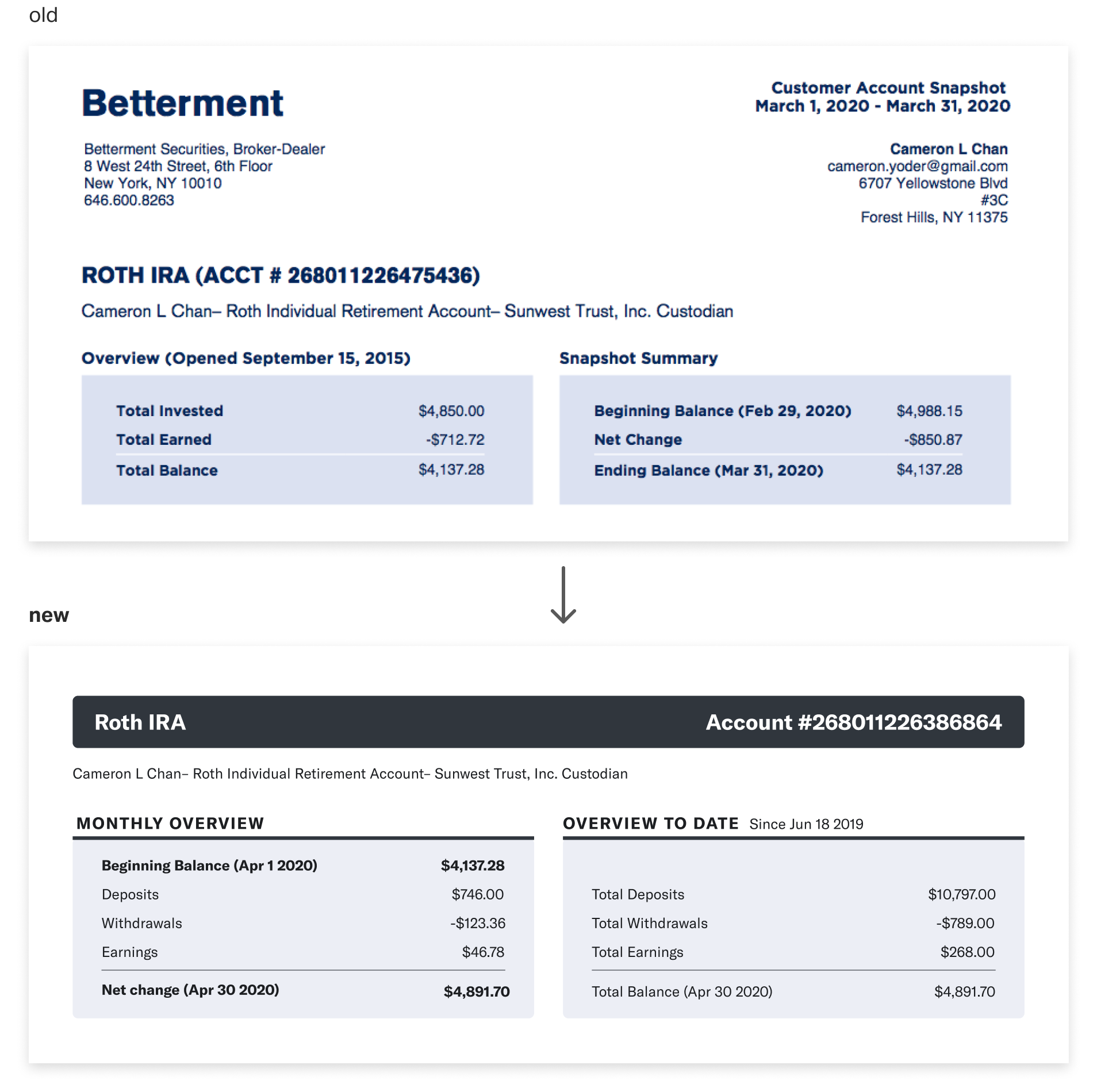
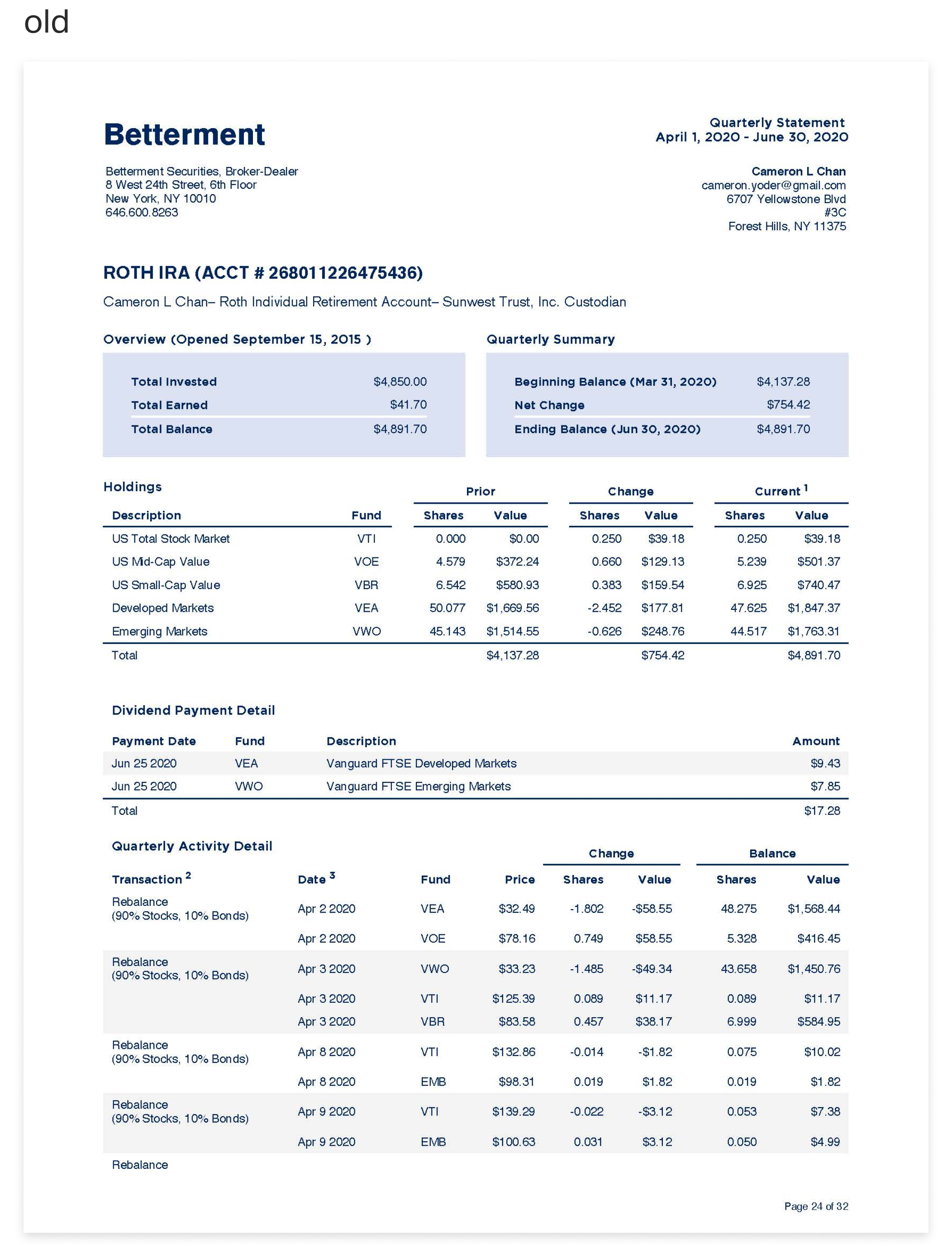
Monthly Statement Redesign
3 of 3 Betterment side project with the Custody Engineering Team 2021Helping customers digest dense content, with clearer hierarchy and typography.
Opportunity
Monthly Statements are documents that users can download to get a comprehensive look into the details of their investing and cash reserve accounts. They are content-dense with tedious info, and the documents were in desperate need of a design update. The following sums up the major changes I made.
Solution
I established a new global module system. The modules serviced several types of statements; e.g. Cash Reserve, IRAs, Investing, Account Snapshots, HSAs, etc.
Three words—complete hierarchy overhaul. These documents needed to be easier to scan. I created a new type system with better hierarchy of sizes and weights, I brought in divider lines and shadows, to name a few examples.
I tried to treat the update like any UX project—my responsibility was to dig into how I could best service our customers. Working with my Technical Product Manager and Compliance Team, I challenged our status quo by being a strong advocate to remove extraneous and confusing data sets, as well as add helpful data (like a much needed table of contents)—as much as we legally could.
The images below are a few examples of the updates I made.